COVID 2.0
Here in St. Louis, politicians have been flip-flopping on the mask mandate in the county and city, now that the CDC has released new Covid-19 guidelines. Most notably, the organization recommends even vaccinated individuals wear masks indoors in public when in areas of high transmission due to the prevalence of the new delta variant.
Today, we will uncover what signals impact the market. So forget about all this political talk that you hear in the news and learn more about the data behind the action below.
Increase in COVID Cases
We’re now seeing a rise in COVID cases across the states. Louisiana has the highest daily average case rate in the United States, with the U.S. only having a 49% vaccination rate.
Then, if you look at the United States as a whole, you can see the behavior of the hotspots. For example, COVID cases show up in the Ozarks, move down to Springfield, cross into Arkansas and Louisiana, and Florida.
When you look closer at the Missouri hotspots, you’ll notice a slight uptick in deaths with a decent increase in hospitalizations. However, taking a closer look at the hotspots versus risk levels, you can infer the city of St. Louis is not one of the risky places. St. Louis is only number 77 out of 117 counties. Therefore, the overarching question is: is there a relationship between the number of people vaccinated versus the amount of Covid-19 cases?
Vaccinations
With most vaccines, the higher the percentage of vaccinated individuals, the less likely an outbreak will occur. But when we look at the numbers of Covid-19 vaccinations in each country, specifically Gibraltar, a region of the United Kingdom, you can see surging cases.
Gibraltar has a 116% vaccination rate, which may not be entirely accurate because data is not always clean. Canada is second to Gibraltar with a small number of cases. The United Kingdom is ranked third with a high rate of increased cases. Also, Sweden’s vaccination rate is higher than the U.S. but lower than the United Kingdom. Sweden has not seen a significant uptick and has zero deaths some days.
Professor Neil Ferguson, the controversial epidemiologist who predicted as many as 200,000 COVID cases a day in the U.K. if restrictions were lifted, is now facing scrutiny after infections continued to drop for the 6th day in a row. Again, this proves models don’t always reflect reality.
Per Capita Deaths
Every country got hit by the coronavirus differently. Still, because we have better therapeutics, even with increasing cases, it may not have the same impact on the market as it did in the past.
For a full deep dive into the second wave of COVID-19 and current market behavior, watch our recap video on our YouTube channel and SUBSCRIBE!
For detailed performance metrics, please don’t hesitate to contact your lead advisor.
And, in the meantime, be sure to keep up to date on Gatewood Wealth Solutions through our daily 3x3s and our weekly market insights on our YouTube, LinkedIn, and Facebook accounts.
Economic forecasts set forth may not develop as predicted, and there can be no guarantee that strategies promoted will be successful. Therefore, the opinions voiced in this material are for general information only and are not intended to provide specific advice or recommendations for any individual.
All performance references are historical and are no guarantee of future results. In addition, all indices are unmanaged and may not be invested directly.
Securities and advisory services are offered through LPL Financial, a registered investment advisor, Member FINRA/SIPC. All investing involves risk, including possible loss of principal. No strategy assures success or protects against loss.
The opinions in this material do not necessarily reflect the views of LPL Financial.
Taper Tantrum
With significant Consumer Price Index (CPI) increases over the last year, many are wondering: “Are index increases transitory?”
Over the last 12 months, all items on the CPI increased 5.4% before seasonal adjustment; this was the most significant 12-month increase since the period ending August 2008.
In reality, everything is transitory because, at some point, it will end. So the question is the duration of time. I think it’s fair to say this increase has lasted longer than what the Fed initially expected, but it doesn’t seem that they’re concerned.
For example, if we look at sales of used cars, you can see a 10.5% growth in June after a 7.3% and 10% growth before. And because the semi-conductor shortage curtailed the number of new cars being created, we see elevated prices in vehicles.
We haven’t seen this type of inflation for quite some time, but if you look at PPG, a supplier of paints, they would say inflation has not been transitory. PPG Industries Inc. repeatedly raises prices of the paint and coatings it sells to customers across industries as inflation in raw material and logistics costs pressures the $40 billion business. Looking back over the past year, we have also seen several home price increases.
Home Price Increases
The annual percentage of home prices in 2020 had a 12-14.5% price change on homes. But then, the monetary policy showed the spike coincided perfectly with the Feds stepping into the market and buying $40 billion per month of mortgage-backed securities. And to top it off, the Feds are still doing it despite a 14% increase. Therefore, the housing market is robust with the question of, “Are we in a housing bubble?”
We hear a lot of noise about house prices, but the biggest driver of home prices ultimately is per capita income. The more money you have, the more house you can afford — and the more you’re going to bid against other buyers. So, the significant long-term driver is the income you produce and the payments you can make to own a home. Just remember, if interest rates are low, the house’s value can appreciate.
Small Businesses Planning to Hire
Are small businesses planning to hire? Can they hire enough workers? The NFIB is a small business association helping understand what is happening from an economic standpoint. William Dunkelberg, NFIB Chief Economist, stated, “in June, we saw a record-high percentage of owners raising compensation to help attract needed employees, and job creation plans also remain at record highs. Owners are doing everything they can to get back to full, productive staff.”
If you look at the data above, we can see that more than 50% of small businesses have at least one unfilled opening at the moment, and 30% of the small companies are trying to hire. However, what stands out is we have more job openings and employees that quit relatively to unemployment. So for those who want a job, there are plenty out there.
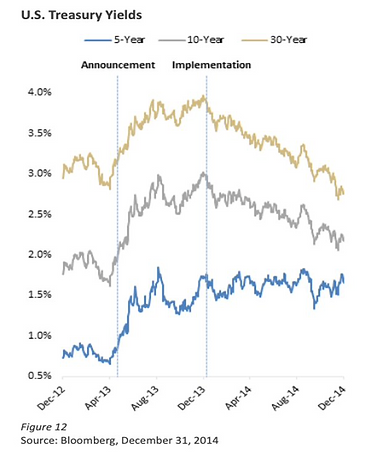
Taper Tantrum
On May 22nd, 2013, Federal Reserve Chair Ben Bernanke announced that the Fed would reduce the volume of its bond purchases.
We saw interest rates rapidly increase from his announcement, causing the media to coin the term “Taper Tantrum.” Unfortunately, because we had never seen this behavior before, there was no policy that we could look back at to see how the statistics would play out.
However, when the Fed began implementing the bond purchase strategy a few months later, you started to see yields decrease again. So the Feds are certainly keeping interest rates lower than they would have naturally, but we don’t believe their suggestions are that far off the natural pace.
This first taper represented a slowing of asset purchases, and it was what we would consider a proper taper. However, the second taper tantrum we’ll look at was much different. Under Federal Reserve Chair Janet Yellen, the Fed announced caps on the maximum number of Treasuries and Agency MBS allowed to roll off each month.
As a result, the Fed’s balance sheet shrunk, but the Fed continued to buy large amounts of treasuries. By signaling a gradual plan, the rates did increase but over a more extended period. Eventually, the rates decreased as the market better understood the implications.
Consumer Price Index (CPI)
The graph you see above — called the Consumer Price Index for All Urban Consumers: All Items (CPIAUCSL) — measures the average monthly change in the price for goods and services paid by urban consumers between any two periods. We had a considerable CPI number of 5.4%, causing yields to come down slightly, eventually rising. But then, July 13th was a growth day where we should have seen a value rotation. Also, the dollar increased relative to other currencies.
Overall, these statistics have been unusual. There has to be more to all of this than interest rates increasing. As the story unfolds, tune in to GWS’ YouTube Live every Wednesday at 3:30 p.m. CT for our take on what’s happening in the market.
For detailed performance metrics, please don’t hesitate to contact your lead advisor. And, in the meantime, be sure to keep up to date on Gatewood Wealth Solutions through our daily 3x3s and our weekly market insights on our YouTube, LinkedIn, and Facebook accounts.
Economic forecasts set forth may not develop as predicted, and there can be no guarantee that strategies promoted will be successful.
The opinions voiced in this material are for general information only and are not intended to provide specific advice or recommendations for any individual.
All performance references are historical and are no guarantee of future results. In addition, all indices are unmanaged and may not be invested directly.
Securities and advisory services are offered through LPL Financial, a registered investment advisor, Member FINRA/SIPC.
All investing involves risk, including possible loss of principal. No strategy assures success or protects against loss.
Q2 2021: Follow the Data, Not the News
Executive Summary
You already know how important it is to us at Gatewood Wealth Solutions to serve as a trusted source of financial information on all things market- and economy-related. We want to signal through the noise to help you understand what’s worth paying attention to and what’s just media hype. But that’s no easy task when you’re finding yourself constantly bombarded with fear-inducing headlines and social media threads.
Recently, we heard one economist share that his mantra is, “Follow the data, not the news.” Of course, that resonated with us immediately, as it’s precisely what we strive to bring to our GWS clients and Weekly Market Insights listeners. The reality is that if you follow the news, it’s easy to become very fearful. Think about it — the news is in the business of selling advertisements. And one of the best ways to get you to sit through a commercial or an ad is to scare you just enough to listen. But, on the other hand, if you look at data, you gain a better sense of what’s happening in the market and make informed decisions based on those insights.
Speaking of digging into the data to find actionable insights, let’s dive into our key themes from Q2 of this year: inflation expectations, value/growth rotation, housing market boom, and supply chain blockages. We’ll start by looking at the market’s behavior as we wrap up this quarter.
Wrapping Up Q2 on a High
As of this writing, today is the last day of the month, and it looks like we’re going to end in a gain position with the market. This will be the fifth month this year so far. But are we at the top?
No one rings a bell when market performance peaks, so there’s no way to be sure. But we are following some fairly pervasive patterns. For example, take a look at the graph below, which shows the seasonality of the market.
As you can see, the chart above looks back over the last ten years at each month. We see how often the S&P is higher from when it began. A few observations:
-
January has been up 50% of the time over the last ten years.
-
If we frame April, May, and June as a quarter, that’s the best quarter based on seasonality.
-
July is up significantly; 89% of the time, the S&P has been positive for July.
-
Going back further, September and October are the months with the highest likelihood of a correction.
You might ask, “If we’re entering into July, will that impact the decisions we make since it tends to be a higher month — and then there’s a higher chance the market will be down?”
The answer is no because most of the time, in this scenario, we still have positive months. Fifty-six percent of the time over the last ten years, the S&P continued to move up and into positive territory during this period. This is known as technical analysis. We think there are economic reasons that corrections happen in October, but this doesn’t tell us if we’re due for one or not.
Next, let’s look at the volatility of the market. What’s the likelihood of a correction coming up?
Let’s start by considering the Volatility Index (VIX)— or what many people call the fear index. This measures options: calls and puts. What are calls and puts? A call option gives someone the right to buy a stock, and a put option gives them the right to sell it. A call is essentially a down payment for a future purchase.
As an example, let’s say Aaron owns AT&T when it is trading at $50. If he sells it to John at $55, and John pays $2 for the right to repurchase it at $55, John might repurchase it when the stock moves up to $60. The longer the option lasts, the more valuable it is.
Since April of 2020, the VIX has been trending down. However, the options in the market are trending in a way that doesn’t suggest a high probability of a correction at the moment. (Watch our Weekly Market Insights recap video for a full explanation of how we measure volatility.)
Theme 1: The Value/Growth Rotation
This quarter’s value/growth rotation has been somewhat of a teeter-totter: volatile on the edges but a calm constant in the middle.
For example, consider the graphs below showing how much the market was plus or minus 1% on a given date. Thus, 2021 looks somewhat average in terms of volatility, which might seem strange. But, there’s more to the story.
Now, let’s look at the edge of the teeter-totter: the ongoing value/growth rotation roller coaster. In the graphs below, we separate growth and value and look at how much they were plus or minus 1% on a given date. Again, you can see the charts look far more volatile.
For most of the year, especially the first part of the quarter, we’ve seen a value rotation in the market. As a result, we’ve made relevant changes to our portfolios, balancing those changes, of course, with tax impacts.
Theme 2: Inflation
Talk earlier this year of an additional $6 trillion in stimulus money sparked many discussions on inflation expectations. Now that those stimulus numbers have been reduced – and we see deflationary forces from technology and other areas – we don’t view inflation risk as high as it previously was. So we may see a bit of a reprieve on inflation going forward, which may also be the reason for the growth rotation mentioned above.
The Biden administration has the difficult task of making Manchin and Sinema happy while also trying to appease more centrist republicans like Romney when going after the filibuster. Currently, we believe the filibuster is too far away from markets and into politics for us to comment on.
Theme 3: Housing Market Boom
As the housing market continues to add fuel to its fire, many people have flashbacks in their minds to 2008 and wonder if another housing bubble is forming. The short answer is yes, it is developing — but it won’t pop now. There are four key reasons why:
-
First, inventory is the lowest it’s been in 20 years.
-
The stimulus bills increased liquidity. As a result, default rates are low, and the number of customers at risk of becoming delinquent is down 90%.
-
Bank lending requirements have changed since the aftermath of the 2008 financial bubble. The practices are much stricter, so it’s less likely to get out of control.
-
Millennials are aging and advancing their careers — so the demand for housing won’t abate any time soon.
Theme 4: Supply Chain Bottlenecks
Avid listeners of our Weekly Market Insights will recognize supply chain bottlenecks as a common topic over the last quarter. However, we are finally starting to see supply chains open up again, although there is still a significant shortage of truck drivers.
We had expected to see a declining dollar to reduce imports and increase exports — but that hasn’t happened yet. This is likely because consumers have shifted their expenditures to imports since the service economy was shut down.
For example, if they couldn’t go to dinner, a couple might have spent that $80 on clothing or another consumer good instead (products that are more likely to be manufactured in other countries; thus, imports). This increase the demand for shipping coming into American ports, but more miniature goods were leaving. This was causing issues in distribution and logistics. Especially for shipping containers, they arrived in the US but did not leave, meaning a global shortage in containers.
Now that the service sector is recovering, it will be interesting to keep an eye on the effect on imports, exports, and the dollar’s value.
Looking Forward
Looking outward at the rest of the year, we believe we are starting to see growth reassert itself.
We were concerned that if we didn’t break through this dome, we would start to dip. I’m happy to say the market wanted to go through that tactical dome, and there was more demand for stock positions (people seeking to buy) than the supply of stocks (people selling at current prices). Hence, stocks moved up at price because there is always an equal number of buyers as sellers.
What’s happening in the market has consolidated and is taking a breather. The longer it’s taking the break and trying to decide if it’s going to upside or downside, the greater the movement will be when it happens. So, we’re reading tea leaves here, but based on technical analysis, this tends to be a good indicator of how much price upside and downside risk we have.
Conclusion
When we start to think about the risk on the upside vs. downside, it’s a pretty favorable market at this point. Of course, there could always be a black swan event. But from a technician’s standpoint, we’re looking at a pretty decent risk/reward ratio when looking at the technical.
As we said, we’re following the data.
Speaking of data — we’re committed to bringing you our interpretation of market data every Wednesday on YouTube Live during our Weekly Market Insights broadcasts at 3:30 p.m. CT.
Be sure to subscribe to our YouTube channel and tune in each week to hear how we adapt clients’ portfolios and our investment thesis for the upcoming investment horizon. We’re here to help you make sure you’re doing the right things to preserve your wealth, which is part of our mission to help people become and remain financially self-reliant.
Disclosures
Securities and advisory services are offered through LPL Financial, a Registered Investment Advisor, Member FINRA/SIPC.
The opinions expressed are those of John Gatewood as of the date stated on this material and are subject to change. There is no guarantee that any forecasts made will come to pass. This material does not constitute investment advice and is not intended to endorse any specific investment or security.
Please remember that all investments carry some level of risk, including the potential loss of principal invested. Indexes and/or benchmarks are unmanaged and cannot be invested in directly. Returns represent past performance, are not a guarantee of future performance and are not indicative of any specific investment. Diversification and strategic asset allocation do not assure profit or protect against loss. With fixed income securities and bonds, when interest rates rise, bond prices usually fall because an investor may earn a higher yield with another bond. Moreover, the longer the maturity of a bond the greater the risk. When interest rates are at low levels, there is a risk that a significant rise in interest rates can occur in a short period of time and cause losses to the market value of any bonds that you own. At maturity, the issuer of the bond is obligated to return the principal (original investment) to the investor. High-yield bonds present greater credit risk than bonds of higher quality. Bond investors should carefully consider risks such as interest rate risk, credit risk, liquidity risk, securities lending risk, repurchase and reverse repurchase transaction risk.
Investors should be aware of the risks of investments in foreign securities, particularly investments in securities of companies in developing nations. These include the risks of currency fluctuation of political and economic instability and of less well-developed government supervision and regulation of business and industry practices, as well as differences in accounting standards.
More of the Same Ahead
Inflation conversations came to a head June 15-16, when the Federal Open Market Committee met and announced the Fed’s new monetary policies. The meeting consisted of 12 individuals — mainly board governors and some representatives from local banks.
The committee target three essential topics during their meeting:
-
The committee decided to keep the target range for federal funds rate at 0-0.25 % until maximum employment.
-
Inflation has risen to 2%, and it is on track to moderately exceed 2% for some time.
-
The Fed will continue to increase its holdings of Treasury securities by at least $80 billion per month and agency mortgage-backed securities by at least $40 billion per month.
Even though we are above the target inflation rate, the graphs below show inflation well above 2% and trending down.
In addition, the Federal Reserve will continue to increase its holdings of Treasury securities and agency mortgage-backed securities until substantial progress has been made toward the committee’s maximum employment and price stability goals. These asset purchases help foster smooth market functioning and accommodative financial conditions, thereby supporting the flow of credit to households and businesses.
It’s also worth noting the dot plots below. Here, you can get a sense of the opinions of the 12 members of the Federal Open Market Committee. They believe the Fed will increase rates in 2023, and the central bank will hike at least twice that year. Only five members still see the Fed staying put through 2023, and seven of the 12 members see the Fed possibly increasing rates as early as 2022.
Indexes of the Market
Let’s look back 20 trading days at the different indexes of the market; we see NASDAQ (red), the 7-10 year treasury interest rate, the S&P 500 small-cap, copper, and gold (two bottom lines).
On June 16th, copper, gold, and the S&P 500 small-cap were already trending low, and they sold off going into and after the FOMC meeting.
Inflation at Risk
Inflation is undoubtedly a risk, but we’re trying to understand what the market is doing. We’re talking about possibly raising interest rates in two years if inflation is still high.
Going back to the beginning of the 21st century, we’ve been at a zero federal funds rate most of the time.
The interest rate banks charge each other to borrow or reserve extra funds overnight.
From 2008-2016, we slowly saw an increase — until 2020, when we went back down to zero. The Fed has historically kept these interest rates low over time, and we don’t believe that will change going forward.
So, let’s go back to inflation. You might expect inflation to be low over the time we’ve been at a 0% federal funds rate, but it has not necessarily been low. We see the 16% Trimmed-Mean Consumer Price Index (CPI) as a measure of core inflation calculated by the Federal Reserve Bank of Cleveland. The Trimmed-Mean CPI excludes the CPI components that show the most extreme monthly price changes. This series excludes 8% of the CPI components with the highest and lowest one-month price changes from each tail of the price-change distribution resulting in a 16% Trimmed-Mean Inflation Estimate.
Therefore, inflation is not necessarily shown in the data, and I don’t think the Fed will respond by raising interest rates. They’ve kept rates down to near 0-25 basis points, but the market responds as if this is a hawkish statement.
In conclusion, GWS believes that the inflation risk is undoubtedly high, but we don’t see a pause in inflation. Remember, high prices solve high prices, and we have seen commodities pullback before.
For detailed performance metrics, please don’t hesitate to contact your lead advisor. And, in the meantime, be sure to keep up to date on Gatewood Wealth Solutions through our daily 3x3s and our weekly market insights on our YouTube, LinkedIn, and Facebook accounts.
Economic forecasts set fourth may not develop as predicited and there can be no guarantee that strategies promoted will be successful.
The opinions voiced in this material are for general information only and are not intended to provide specific advice or recommendations for any individual. All performance references are historical and are no guarantee of future results. All indices are unmanaged and may not be invested directly.
Securities and advisory services are offered through LPL Financial, a registered investment advisor, Member FINRA/SIPC.
All investing involves risk, including possible loss of principal. No strategy assures success or protects against loss.
Radical Transparency
Lately, we’ve been getting several questions from clients regarding the performance of our taxable accounts. While we can’t publicly publish performance numbers due to legal constraints, we are always happy to walk you through your portfolio’s performance in detail! Just contact your lead advisor if that is something that interests you.
In the meantime, we can share our approach to structuring our taxable accounts: our tax-sensitive, wide mode, and builder strategies, to be exact. Now, you’ll have a line of sight into what goes on behind the scenes with your money.
Full warning, this is going to be a deep dive! We’ve done our bests to make these concepts graphics-oriented, but this topic does require a fair amount of data and tables. So hang with us.
How We Measure Performance
To start, let me set the stage that all the numbers you’re about to see are based on hypothetical accounts. Everyone’s account won’t always reflect these traits; they are simply the theoretical models to evaluate performance against benchmarks. That way, if our portfolios aren’t tracking the way we expect, we will know why.
How do we monitor our account performance? We’ve made it simple with the acronym S-A-M-U-R-A-I:
Specified in advance
Appropriate
Measurable
Unambiguous
Reflective of current investment options
Accountable
Investable
Throughout this blog, we’ll walk through examples of how we monitor performance — using only the highest Chartered Financial Analyst, CFA, standards.
Manager Selection
Regarding manager selection, our approach is generally to ask, “Did you beat your benchmark or not?” And, more importantly, “What benchmark did you choose to measure it against?”
Any easy way to think of this concept is pictured above. Look at the big box (above) as our benchmark, with increasing performance and excess return. The excess return can either do better or worse than the benchmark. For example, over the last five years, there has been a negative access return.
Asset Class Domes
Asset class domes are the mix of stocks and bonds in your portfolio. These can exist across all asset classes, but the math gets more confusing each time you add additional asset classes. For this example, let’s consider a 60/40 portfolio.
At GWS, we generally recommend overweighting equity and underweighting fixed income, especially given today’s inflation risk. If you’re in bonds, you risk eroding your principal and purchasing power.
So, if you had a risk profile that suggested you should be a balanced investor, GWS would likely recommend an 80-20 allocation but measure it to a 60-40 benchmark. Then, you have precise data to use to analyze if our active weights helped or hurt performance.
Another way to look at this is with a bar chart. On the left, you have stocks, where we have 80% vs. 60% in the benchmark and 20% bonds vs. 40% bonds. Then, if you get into more detail, you can see the net difference of 20% positive and negative. That’s the way we look at portfolios; what’s the net relative to the benchmark?
Now let’s look at the effects of performance. For example, we have stocks performing at 12% and bonds performing at 4% in our hypothetical with weights.
We would say stocks multiplied by 60% equals an 8.8 in benchmark between the stocks and the bonds. But 7.2% of that 8.8% was attributed to equity performance. Then, if we look at bonds, we get 160 basis points.
Now, let’s look at our 80-20 allocation. We added 20% extra to stocks, resulting in a 9.6% return for our equity position and 0.8% for our bonds. That’s 10.2 vs. 8.8 — meaning investors are pretty happy relative to their benchmarks.
For detailed performance metrics, please don’t hesitate to contact your lead advisor. And, in the meantime, be sure to keep up to date on Gatewood Wealth Solutions through our daily 3x3s and our weekly market insights on our YouTube, LinkedIn, and Facebook accounts.
All examples are hypothetical and are for illustrative purposes.
The opionions voiced in this material are for general information only and are not intended to provide specific advice or reccomendations for any individual. All performance references is historical and is no guarantee of future results. All indices are unmanaged and may not be invested into directly.
Securities and advisory services are offered through LPL Financial, a registered investment advisor, Member FINRA/SIPC.
Consumption Over Investment
During last week’s weekly market insights webinar, John and I continued our conversation on debt and inflation. Of course, we are no stranger to these themes on our calls — but they’re becoming more timely than ever with the media hype around inflation. So let’s start by talking about debt. Is it good? Bad? Possible to be both?
Before we dive in, let’s review the definition of debt and the types that exist:
Debt, by its simplest definition, is an exchange of present goods for future goods. Today, we’re breaking debt into two categories: 1) consumption debt and 2) investment debt.
Let’s think of this as a pension system, considering government debt.
If you are in a pension system, you take a reduction in what you could consume via the decrease in your current pay. The government will use that reduction to purchase investments, the profits of which they’ll use to pay you back through Social Security and other payment vehicles.
Let’s walk through four concerns we’re seeing in data surrounding our national debt.
Problem 1: Less Economic Growth
Chart 1 shows GDP growth per capita in developed, emerging, and developing economies. The blue countries represent a low debt burden to production ability within the economy, and the red represents countries with high debt loads. So, if a country is at 30% or less of its GDP debt, it will grow on average of 2.6%, where those with higher debt burdens will be at 1.7%. Therefore, you can conclude that higher debt loads will offset production.
Problem 2: Disincentivizing Investment and Reducing Productivity
The second problem is an extension of the first. One of the best indicators of an economy’s future growth is its investment rate. When investment increases, so do productivity, which is accompanied by economic growth. Thus, if countries with less debt grow faster, these countries may see more investment and more significant productivity growth. Chart 2 shows how countries with less debt see more excellent investments.
Another way to look at this is production per work. Ultimately, the wages of workers are dependent upon the output of workers. Production is increased through investing, not consuming.
Problem 3: Deteriorating Solvency
We also see an effect on the amount of debt across the world. For example, the amount of public debt relative to tax revenue has increased in Asia, Latin America, Europe, Africa, and other countries worldwide.
If we go back to the great recession, we see the world’s debt has been accelerating. Look at the different regions below and the debt they carried before the 2007 great recession (blue) versus before the 2020 lockdown (red).
Going into the great recession, Japan was at 176% of the debt. Then, going into lockdown, it was at 235%, compared to the United States at 73% before 2007 and 104% in 2020. Therefore, the United States was below average going into the great recession, growing faster than other economies.
Problem 4: The Relationship Between Inflation and Debt Default
The link between inflation and the accumulation of public debt (and sovereign bankruptcy) is relatively recent; as seen in Chart 5, countries that find themselves defaulting on public debt experience more than triple the inflation rate of countries that honor their commitments. However, in the twentieth century, due to the change in the monetary system, it became possible to pay off public debt through inflation.
History Does Not Repeat, but if often Rhymes
We don’t know what history will look like, but we have an idea of what it’s trying to achieve.
Once again, not just in the U.S. but across the globe, debt is trending upward. Japan is the highest at 257% of debt to GDP, with the United States at 133%. However, you do have some European countries that are relatively low as well.
As we’re in an inflationary system, we are not calling on what inflation will be. But since the U.S. government has been making consumption loans, the United States should be positively affected if we get infrastructure spending.
Keep up to date on Gatewood Wealth Solutions through our daily 3x3s and our weekly market insights on our YouTube, LinkedIn, and Facebook accounts.
Stock investing includes risks, including fluctuating prices and loss of principal.
Economic forecasts set forth may not develop as predicted, and there can be no guarantee that strategies promoted will be successful.
The opinions voiced in this material are for general information only and are not intended to provide specific advice or recommendations for any individual. All performance referenced is historical and is no guarantee of future results. All indices are unmanaged and may not be invested directly.
Securities and advisory services are offered through LPL Financial, a registered investment advisor, Member FINRA/SIPC.
Debt Clock
Federal debt is a new hot topic on our minds today. Currently, we’re looking at more than $28.3 trillion — which breaks down to more than $85,132 in debt per U.S. citizen. How long can we sustain this level of debt — and are we in danger of watching it collapse?
Let’s start by comparing the 2000 to 2021 debt clocks, which show us how drastically debt has increased over time. You can even watch the live debt clock here.
As you are comparing these images, keep in mind that the U.S. has seen an 18% increase in population (281 people to 333 million). The workforce has increased 21%, growing from 103 million people to 125 million. That means the workforce has grown faster than the population, with the millennials being a large part of growth.
Next, let’s look at CPI, money over time. A basket of goods that was $169 in 2000 would now cost you $266.83. So what do those changes look like from 2000 compared to 2021? Again, the revenue or GDP (Gross Domestic Product, shown in green) is at $22.1 trillion, and the federal tax revenue is bringing in $3.4 trillion.
When comparing both data sets below, we can see that the GDP is now at $22 trillion, where it was at $9.5 trillion in 2000 – a 131% increase. Then, if we look at tax revenue, we have a 78% increase since 2000. Remember, there was a surplus in 2000, so now we’re at $3.4 trillion in revenue.
So, let’s talk about the different tax breakouts. We have income tax with an 83% increase, payroll tax at a 108% increase, and corporate tax revenue with a rise of 7%. Therefore, revenue has grown, but you can see the corporate tax has stayed the same due to the recent tax law changes favoring taxing income over corporations.
U.S. National Debt
As of June 11th, U.S. national debt was at $28.3 trillion. The federal spending was at $6.7 trillion with a deficit of $3.2 trillion. Comparing this to 2000, we can see the GDP grew 131%, our national debt grew almost 400%, and our government spending has grown 285%. Thus, government and deficit spending are showing up as debt, ultimately exceeding GDP growth.
Where is the government spending so much money? The bulk of it can be traced to the four following categories:
-
Medicare and Medicaid: 298% Increase
-
Social Security: 180% Increase
-
Interest on Debt (Net): 77% Increase
-
Defense and War: 137% Increase
Why is our debt expanding at a faster rate than GDP?
It’s disconcerting to realize that our debt is growing more quickly than our GDP. What is the reason for this? Well, several items show as government liabilities coming out of budgets that are still unfunded. These unfunded liabilities equal a whopping $148 trillion, and they include Medicare and Social Security.
Another factor is heightened payroll taxes. In 2000, we had payroll tax revenue of $640 billion and Social Security of $400 billion. So essentially, we were collecting more than what we were paying out.
Medicare Enrollment
Let’s look at Medicare and Medicaid next, where we continue to see increased enrollment. In 2008, we were at $605 billion in net spending, with a trend going up to $1.2 trillion through 2030. Spending will continue to progress — not to mention become more complicated with government borrowing as the expansion is monetized.
If we include the expense for interest rates on government spending in 2000 and 2021, we have $5.6 trillion in debt. The average interest in 2000 was 4%, where today, the average claim is 1.4%. That’s a significant reduction in the rate.
The moral of the story? National debt may not be going anywhere soon. But by staying ahead of it and understanding it, we can make more informed decisions about the way we invest our money.
Keep up to date on Gatewood Wealth Solutions through our daily 3x3s and our weekly market insights on our YouTube, LinkedIn, and Facebook accounts.
Stock investing includes risks, including fluctuating prices and loss of principal.
Economic forecasts set forth may not develop as predicted, and there can be no guarantee that strategies promoted will be successful.
The opinions voiced in this material are for general information only and are not intended to provide specific advice or recommendations for any individual. All performance referenced is historical and is no guarantee of future results. All indices are unmanaged and may not be invested directly.
Securities and advisory services are offered through LPL Financial, a registered investment advisor, Member FINRA/SIPC.
Bound up Supply
Supply Chain Stoppage
During the COVID-19 global lockdown, supply chains around the world halted overnight. Conex boxes (or shipping containers — pictured above) can only be moved on and off a boat one at a time. You can imagine how this immediately created supply chain bottlenecks that only compounded over time.
Already, the U.S. is not only back to pre-lockdown import numbers but 20% higher. Our exports have decreased, and we’ve added ships. This created physical bottlenecks at ports because there is only so much ship volume one port can handle. The same issue happened to railways and airlines and an abundance of volume without enough infrastructure to support it.
The Country Re-Opens
During the height of the lockdown, American’s spending on service-oriented industries — such as restaurants, hair salons, etc. — completely halted. Instead, we brought in more essential, tangible goods, which led to an increase in imports.
Now, as the United States opens up, we’ll shift our spending money back to service-related industries, thus decreasing the demand for imports.
You might hear the Federal Reserve use the word “transitory” to describe inflation — suggesting it will be short-lived before bouncing back. But it’s unlikely that many of these commodity prices will ever reverse back to pre-pandemic levels. And we are going to see other waves of inflation, such as federal policy tariffs. Just recently, the U.S. government announced they would double the tariffs on softwood imports coming in from Canada. Pre-pandemic, a thousand feet of lumber cost $396. Now, that number is up to $1,700.
Where Should I Invest Now?
When considering how to invest your money in an economic environment like this one, it’s helpful to prioritize preserving not your principle but your purchasing power. In other words, it’s essential to consider your investments in the context of inflation.
So, let’s look at current stock risk. Looking at the data set above, you’ll see stocks are riskier than bonds. However, that’s not to say that you shouldn’t have bonds or you shouldn’t have cash. If you have a one- to three-year horizon, you should insulate some of that risk by holding the money you need during that time.
What Is the Effective Funds Rate?
If you want to become and remain financially self-reliant, it’s going to be stocks that get you there. Just consider 1802-2013 in the graph below, where you’ll see a pronounced real return after inflation.
Stocks have performed at 6.6% long-term, while bonds only made it to 3.5%. A few sub-periods to include:
-
1802-1870: No big central bank moved the interest rate; it was more market-determined. We can see the bonds during that period paid 4.8% versus stocks’ 6.7%.
-
1871-1925: We see stocks at 6.6% and bonds at 3.7%. State-sponsored banks were helping keep interest rates lower in each condition, so bonds were suppressed.
-
1926-2013: The Central Bank was established and quickly started increasing the money supply. This decreased interest rates, so bonds have not been able to keep up with the same types of return.
In the post-World War II periods of 1946-1965, bonds went to -1.2%, and stocks were at 10%. In the 60s to 80s, you see high inflation with no real return. Looking at the effect of the federal funds rate in the 1960s, you can see interest rates were low, similar to where they are now. Now, we wait and see if history will repeat itself — while keeping a finger on the pulse of the economy and market movement so that you can make informed decisions about your money.
Keep up to date on Gatewood Wealth Solutions through our daily 3x3s and our weekly market insights on our YouTube, Linked In, and Facebook accounts.
Stock investing includes risks, including fluctuating prices and loss of principal.
Economic forecasts set forth may not develop as predicted, and there can be no guarantee that strategies promoted will be successful.
The opinions voiced in this material are for general information only and are not intended to provide specific advice or recommendations for any individual.
All performance referenced is historical and is no guarantee of future results. All indices are unmanaged and may not be invested directly.
Securities and advisory services are offered through LPL Financial, a registered investment advisor, Member FINRA/SIPC.
A SAD Story – Supply and Demand
Inflation as a Major Headline
Going back to 2004, inflation was still reasonably new. We can see that going into 2014, the number of people searching for inflation was significantly higher.
Now, inflation has been dominating the headlines. According to the graph below, the Purchasing Price Index (PPI) and Consumer Price Index (CPI) have gone up relative to where they have been. However, this is an annualized component. As one product moves up in value, there’s usually less money for most consumers to spend elsewhere. Therefore, other products are going to pull back.
Look Under the Hood
What’s driving the broad index up?
On the far left of the bar chart, we see reopening prices, such as transportation services. For example, as the economy’s reopening, people are buying airline tickets. The increase in sales of those tickets will create demand, causing an increase in value. Air travel is also very energy-dependent, so there will be increases in fuel. Remember, we have temporary supply disruptions, not just the demand component.
Also, car prices have driven the CPI up. Semiconductor manufacturers anticipated lower demand in the automobile industry. The number of conductors in cars was only the ignition, but fuel injection and LCDs have become more popular. The cost is 50% of manufacturing; however, there is a significant shortage. Therefore, new cars are not coming off the lot as fast, and demand for used cars has gone up dramatically, pushing the CPI up.
Supply or Money Problem?
Traffic coming from Asia going into Los Angeles ports is causing a backlog due to high demand, ultimately making it difficult to get products in the United States. There have been about 19 ships anchored, with the average waiting time at 6.6-6.8 days before drop off. They expect the wait to be cleared by June 1st. The supply of goods coming in and the amount of imports is causing price increases.
Then, we have lumber. Sawmills have been closed during COVID because they didn’t expect housing to increase rapidly. As people move from California and New York to states with low taxes and less regulation, they’re leaving their houses unsold. Not only will the supply of lumber need to be steady, but it will also increase because there’s a need for a lot more homes. Another unique characteristic of the coronavirus is dining out, causing a ketchup package shortage. It’s both a supply and demand problem.
Then, there’s the infrastructure problem, and there have been investments in renewable energy. For example, Texas had 20-30% of its energy supported by renewables and newly built gas power plants. We’ll find many solutions that aren’t known over the next several years as this becomes more pervasive. Therefore, new infrastructure is not necessarily dependable.
Now, we don’t just have the new infrastructure, but antiquated infrastructure as well. The bridge crack in the bottom left (above) is connecting West Memphis with Missouri. Not only did it stop the traffic crossing, but the barges couldn’t cross underneath it. However, whenever we look at the infrastructure bill, it’s not dealing with a lot of this; it is more helping individuals and people. There’s been a lot of criticism on what is considered infrastructure on the bill.
Economic Recovery
We will see rising prices in commodities, and one area that’s been a big boom has been copper. Chile had an election to add complications, and the far left in-country has now gained control of the government. They want to nationalize a lot of the commodities procurement industry, which is the primary industry of Chile. They produce 67% of the copper production globally.
In addition, they’re significant producers of lithium, which is crucial for electric vehicles. One of the bottlenecks for electric cars becoming the norm is the amount of lithium that we can extract. Some people are working on making it synthetic, just as much as they are with synthetic diamonds. If we can’t go to the alternative energy and store other power, there will be additional upward pressure on oil.
Wages have Risen
Significantly lower wages below $60,000 have sharp increases. There will still be people getting paid more to be on unemployment and will not take the jobs. We can see it’s certainly affecting the market because the lower-income areas have to compete against benefits.
The more money the lower-income gets, the more they will use for consumption. So they’re going to buy more food, upgrade their shelter, and buy clothing because they have been skimped in those categories. As their wealth increases, their next dollar will be spent on those categories. It’s not going to be spent on savings, stocks, and other financial assets. Therefore, we might see consumer prices from higher wages on the lower-income be an additional wave to deal with inflation.
Stimulus
If we look at the government spending and personal savings rate on the graph above, we can see that a lot of that money is still sitting idle and ready to be put into the market. There’s likely to be a nice uptick in retail sales because most of this money will make it into the economy as stores begin to reopen to the total capacity.
In the market, inflation expectations on bonds are projected to be 2.5-3% inflation for the foreseeable future. It should lead to higher interest rates, but if the Fed is acting as the market and buying up bonds, you could see interest rates stay stable with inflation high.
Price Points for Dollar Cost Averaging
We can see that the S&P 500 bounced off its 50-day moving average. There’s a good chance that we go through the 50-day moving average and try to get some consolidation in the market. However, there could be a concern with the infrastructure and stimulus bills being passed sooner rather than later.
Then, if we glance through the technicals above, considerable cap value is coming back while the S&P 500 is doing better than most international asset classes. We can see commodities near the top, with real estate doing well and Gold moving up.
Keep up to date on Gatewood Wealth Solutions through our daily 3x3s and our weekly market insights on our YouTube, LinkedIn, and Facebook accounts.
Economic forecasts set forth may not develop as predicted, and there can be no guarantee that strategies promoted will be successful.
The opinions voiced in this material are for general information only and are not intended to provide specific advice or recommendations for any individual. All performance referenced is historical and is no guarantee of future results. All indices are unmanaged and may not be invested directly.
Securities and advisory services are offered through LPL Financial, a registered investment advisor, Member FINRA/SIPC.
Labor Pains
Payroll Gain is Amongst Largest Downside Miss Ever
Payrolls rose $266,000 from a month ago, according to a Labor Department report Friday, May, 7th 2021 that represented one of the most significant downsides miss on record. Economists in a Bloomberg survey projected a $1 million hiring surge in April 2021.
Catching the media’s eye, there is some concern from a miss standpoint. This would be the biggest miss ever at more than three standard deviations out from the mean, so in other words, it shouldn’t have happened.
McDonald’s Struggle with Unemployment Benefits
The National Owners Association (NOA) is an organization “to unify Owners to “Lead Together Again” and save our culture while assuring the owners have net cash flow growth, financial viability and are immune from intimidation and retribution.” McDonald’s is a part of this organization. They’re having trouble hiring employees due to unemployment benefits and say an ‘inflationary time bomb’ will force them to hike Big Mac prices up.
Here are a few key quotes from the NOA letter to its members:
“What’s going on here? When people can make more staying at home than going to work, they will stay at home,” the letter read, which was obtained by Insider. “It’s that simple. We don’t blame them. We fault the system.”
“Natural human behavior is to choose to receive more money while staying at home than working for a highly demanding job — especially with the amount of stress that is being put on employees right now.”
Welfare Wall- Economy
In the below chart from Gary Alexander, Secretary of Public Welfare, Commonwealth of Pennsylvania, explained, “a single mom is better off earnings gross income of $29,000 with $57,327 in net income with benefits than to earn gross income of $69,000 with net income and benefits of $57,045.” They came up with this ten years ago. So $69,000 is a good salary now, but an excellent salary then. The skillset that is needed to bridge that gap would be pretty difficult to cover.
But what was more shocking is the chart below that Steven Rattner, New York Investment Asset Manager, tweeted. The chart showed tens of millions of US workers, in jobs ranging from the dishwasher, to the hotel clerk, to preschool teacher, to anyone on minimum wage, can now earn more from unemployment than from their regular job.
If you look at the unemployment bar, people get an equivalent of $11.23 to $7.25 per hour for minimum wage. Also, the median salary of $20.08 is compared to $17.78. As you can see, unemployment benefits have affected different parts of the labor market differently.
So, what is the other argument outside of just unemployment benefits taking up additional employees?
If you look at who is going back to work, there are many more men represented than women. It may not be disincentives, but rather the burden of children still at home from school falling on women, not allowing them to go back to work. Another problem with this is the question of the labor market having to compete with the government to get these people to come back to work.
We are not seeing the polls that you would expect if they were competing with the government. You would expect the low-wage employment to be rising as they’re trying to offer higher benefits to attract the person coming in.
The next issue is regarding the miss and not showing up in other datasets. If we look at the chart below from ADP Research Insitute regarding data leisure, hospitality, trade, and transportation, these areas pick up the most jobs and have the most job openings.
The data shows $742,000 of payroll gain compared to $266,000 from the Bureaus of Labor Statistics. At the moment, GWS believes a lot is going on here, and probably a significant part is sampling. The Bureau of Labor Statistics is trying to control things such as working part-time, contracting, going full-time, how many companies have been created, and how many companies are lost, ultimately showing a sample error.
Effects on the Stock Market
What has been driving the stock market is stimulus, whether it’s a federal stimulus or not. The federal reserve still sees these unemployment numbers, and they have a dual mandate to maintain the purchasing value of the currency and keep unemployment low. They think inflation’s transitory, moving to a 36 month rolling 2% average. When we look at the data, we have some low numbers going back 36 months.
They think inflation isn’t a thing, but they are working out of a paradigm, a trade-off between inflation and unemployment. Whatever the reasoning behind the actions is, the Feds are going to continue to be accommodated. Next, we have unemployment data that says the recovery isn’t happening as quickly as we like. CPI is on an annualized basis at 0.8, that’s 9.6%. You can see in the chart below if inflation did cause interest rates to move up, then the 30 years could be down 20% and the ten years down 8-9%.
Keep up to date on Gatewood Wealth Solutions through our daily 3x3s and our weekly market insights on our YouTube, LinkedIn, and Facebook accounts.
Economic forecasts set forth may not develop as predicted, and there can be no guarantee that strategies promoted will be successful.
The opinions voiced in this material are for general information only and are not intended to provide specific advice or recommendations for any individual. All performance referenced is historical and is no guarantee of future results. All indices are unmanaged and may not be invested directly.
Securities and advisory services are offered through LPL Financial, a registered investment advisor, Member FINRA/SIPC.